Selling Houses Australia: Colour & pattern in Greystanes
A groovy Greystanes revival story
Wendy Moore’s aim for the interiors featured on Selling Houses Australia is to smash the perception that to sell a home, you have to decorate ‘safely’. It’s simply not true, and when you have a property like this Greystanes NSW home, it’s more effective to lean into its hidden charms. Wendy took on the task to transform a completely original and untouched abode still trapped in the 70s into a stunning haven of style by heroing the era in a groovy, modern way. That meant bringing in a wash of pattern and colour to every room.
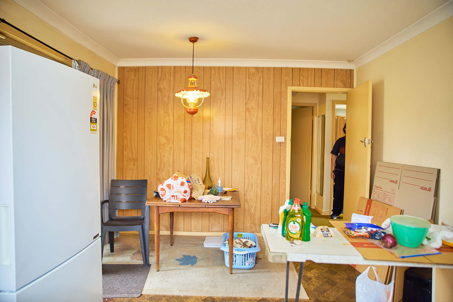
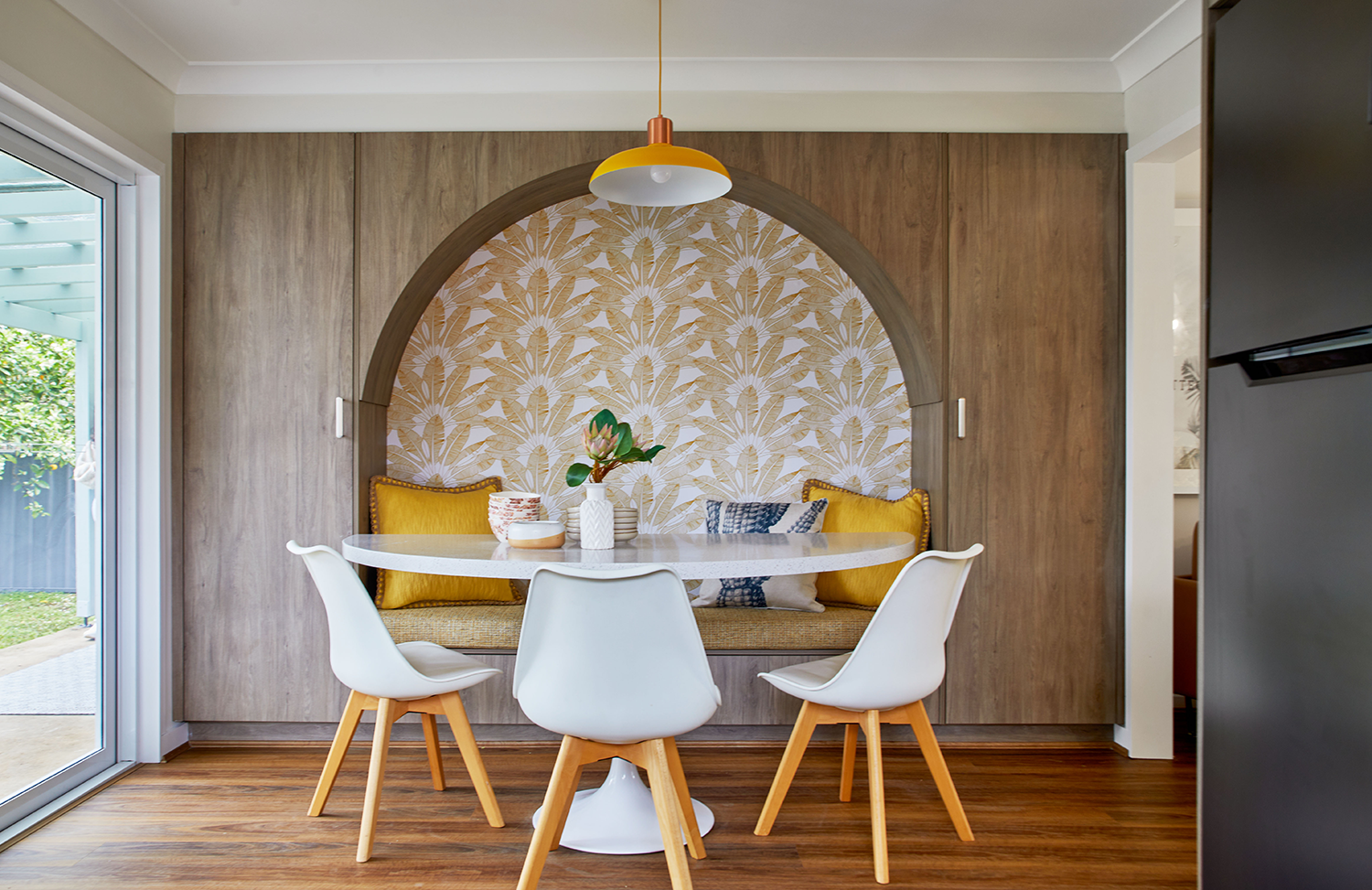
Dining: This home was crying out for some extra living space - and knocking down a wall between the kitchen and living area gave it a fabulous new floorplan and the sense of space it needed. To create cohesion and to link the areas, Wendy carried the Polytec Laminate in Antico Oak cabinetry from the kitchen to this cool built-in dining nook. The sweeping arch of the storage-packed cabinetry is a super space saving solution, which also highlights the zone, but it needed something extra. Enter, the Golden Palm Fans wallpaper feature from Pickawall, which makes a focal point and draws people in. Against the earthy neutral of the cabinetry, the yellow print really pops.
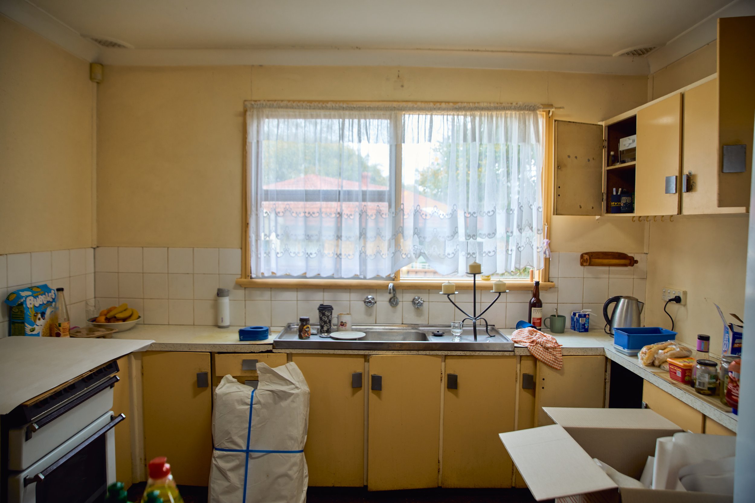
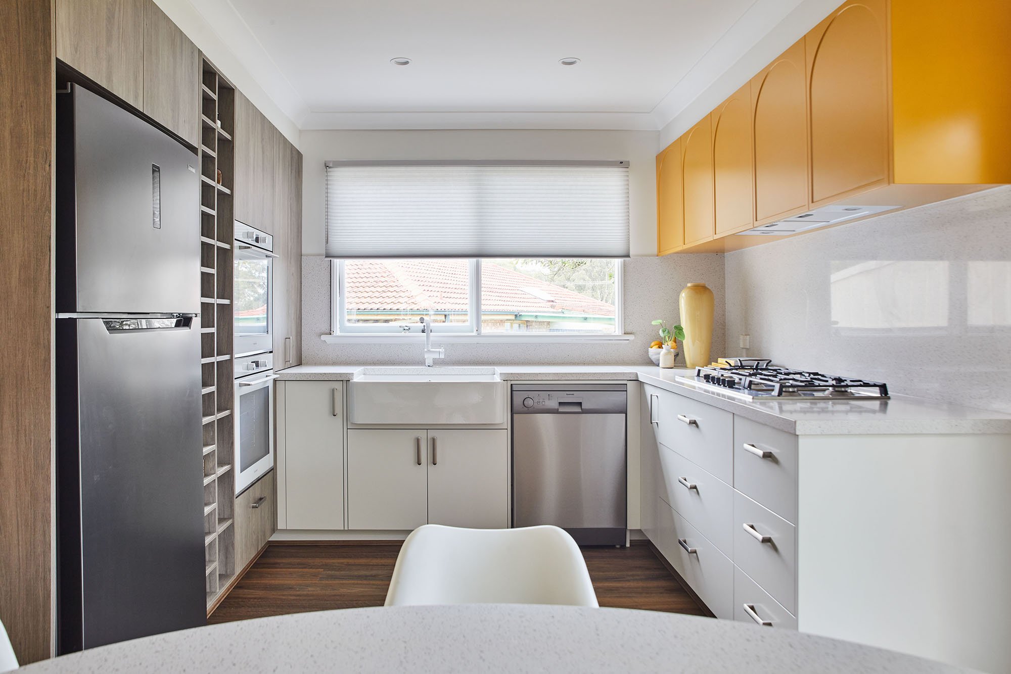
Kitchen: This original kitchen was fresh from the 70s - but Wendy knew a second act was possible! It needed all new cabinetry that was functional, fabulous and a ‘look at me’ moment. The arched profile on the upper cabinetry echoes the dining nook and nods to the home’s era, while a bright finish in Wattyl ‘Honeypot’ brings a lovely sunny vibe. On the lower cabinetry, Wendy kept it simple because this space already had a fair bit of texture - not every finish needs to be a statement maker.
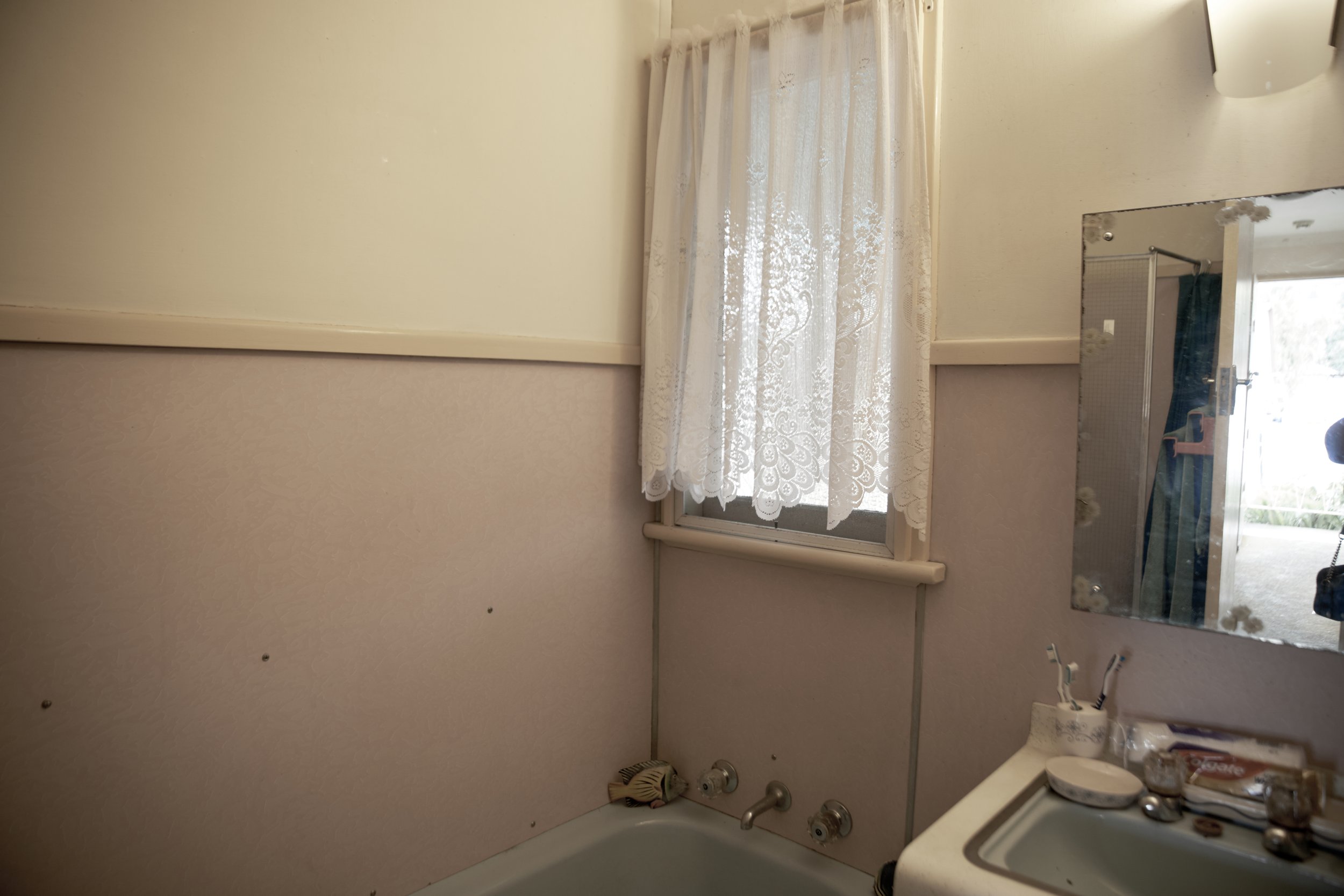
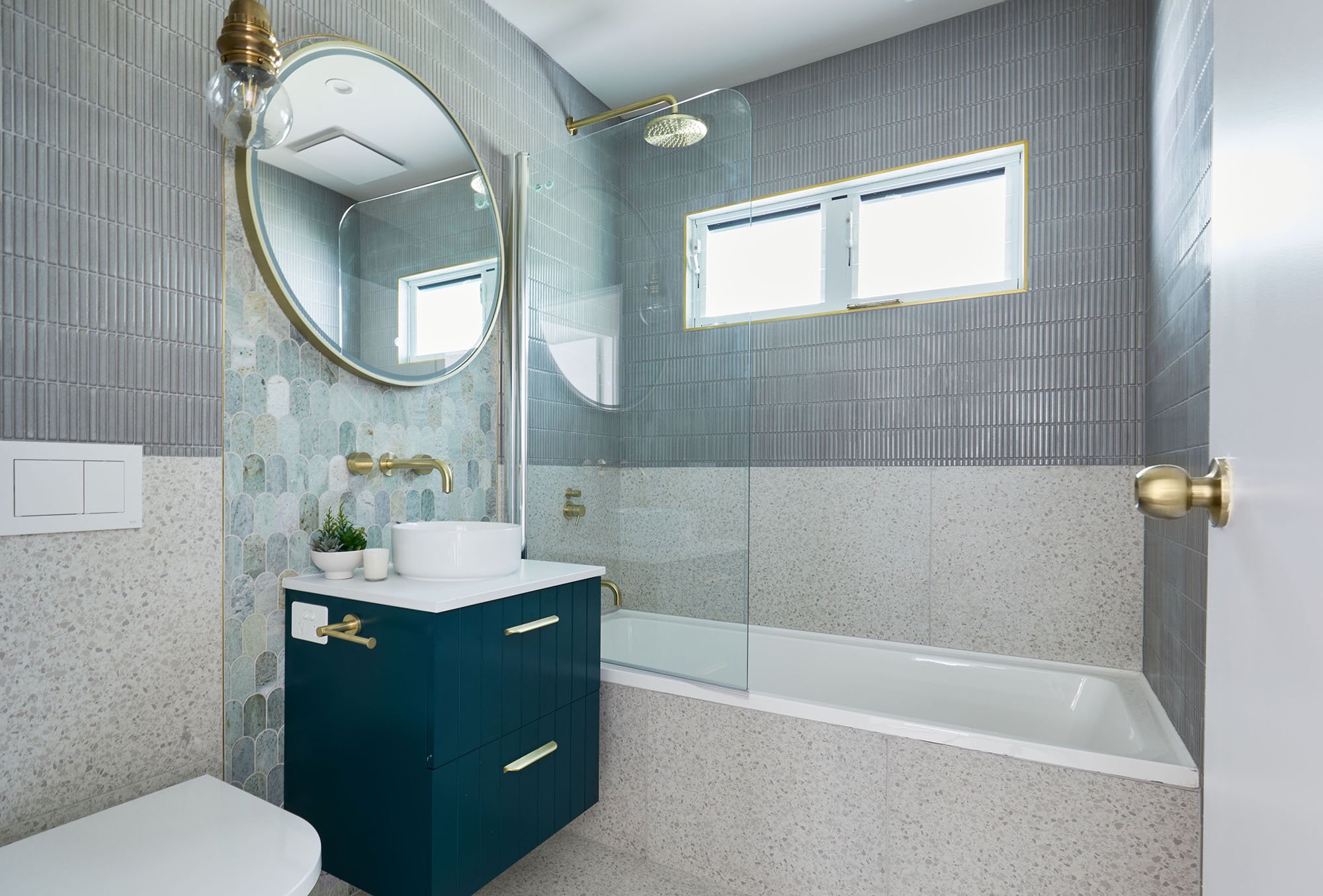
“The fish scale-style mosaics bring a gorgeous wash of blue, seafoam green and turquoise - and the shape and colour palette complements the elongated rectangular mosaic tiles perfectly” ~ interiors expert Wendy Moore
Bathroom: It’s amazing what the right mix of tiles can do, elevating a space from basic to inspired so simply and effectively. This glamorous little wet zone now has three tiles all from Beautmont Tiles, each with subtle pattern and movement. For the floors, we wanted something simple - a tile with a dash of marble and aggregate that nods to on-trend terrazzo was the obvious choice for 70s-infused style. The true hero here is the strip of tiles that acts as a splashback to the vanity, while making it a key feature of the room and drawing the eye upwards - a great design trick in small spaces like this!
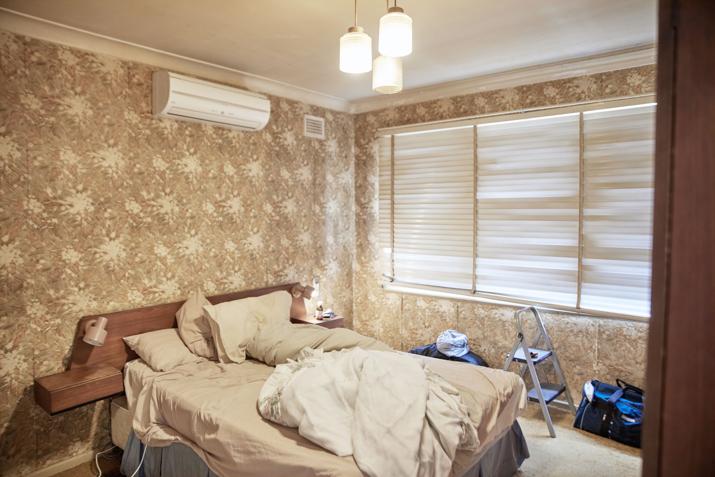
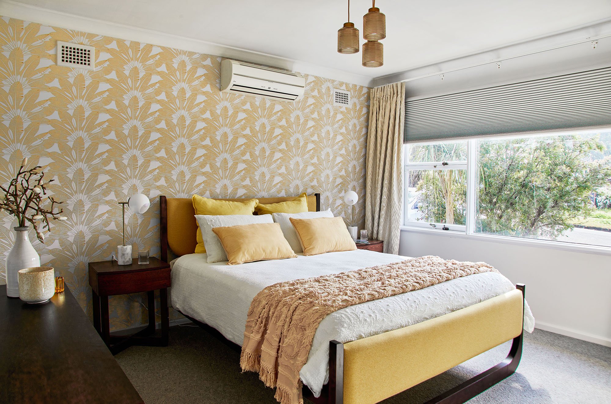
Bedroom: While the transformation in this bedroom feels huge, it’s basically a clever refresh. Using the same wallpaper in this bedroom as in the dining nook is a win for a few reasons - firstly, it helps the home feel resolved; connected; considered. And secondly, there’s a great cost saving to be had! From a design perspective, it allowed Wendy to lean into the palette of warming timbers and pops of mustard yellow. And how cool is that custom upholstered bed? Find this Lotus bed frame in Tasmanian Oak, upholstered in Warwick fabric, at Snooze. The rest of the walls feature a calming light grey tone that is soothing to the eye and provides balance in the scheme.
