Clever kitchen makeovers from Selling Houses Australia Series 16
The latest series of Selling Houses Australia featured kitchens of all shapes, sizes and conditions, each with unique makeover ideas for homeowners and wannabe home sellers. Here’s a breakdown of each look
Photography Melissa Heath/Selling Houses Australia
Selling Houses Australia is renown for low-budget renovations that deliver big results. The most expensive area to renovate in a home is usually the kitchen, yet this season featured some remarkably impressive updates, considering the budget restraints! Here are some of our favourites, with all the details on how she did it.
“With each kitchen, I wanted to increase functionality, add beauty and to continue the style story of the home” ~ Wendy Moore
Modern entertainer’s kitchen in Safety Beach
Kitchen style: Modern entertainer
Key features: A cool white and blue coastal palette, butler’s kitchen and large-scale island.
The brief: More suited to an apartment than a five-bedroom home, the kitchen was the one room in a gigantic Safety Beach home that didn’t feel spacious. To connect it to the rest of the home, Wendy had to rework the layout, removing the wall to the dining room and creating space for a butler’s kitchen behind a new nib wall.
How Wendy did it: Wendy chose flatpack Kaboodle cabinetry (available at Bunnings) with a Magnolia stone benchtop for a splash of luxury. The cabinets below are painted in a gorgeous creamy white Almond Sugar by Wattyl, and the kitchen island and wall cabinets carry through the coastal vibes with sophisticated Deep Sea Dive, also Wattyl. New Euromaid appliances are much more suited to the scale of the home, including a 90cm freestanding electric oven with a gas cooktop (GE90S). The butler’s pantry as big as the original kitchen!
Adding an island bench made a big difference, bringing storage, seating and masses of extra bench space. Wendy wanted a minimum of 1200cm all around the island so the space would flow and make a great entertainer’s kitchen. Above, a Nordlux Circus 27 Pendant Light Large E27 in White from The Lighting Outlet added a dash of modern styling.
A kitchen with style for less in Windsor Downs
Kitchen style: Laidback contemporary
Key features: A fresh and bright vibe with Shaker style cabinetry that gives the kitchen a classic but contemporary vibe, along with a generous island.
The brief: The whole home had a sad, dated vibe, which called for a classic makeover, where paint and new surfaces made a huge difference. The kitchen was the same: very well made but incredibly dated. It needed to be brought in the 2020s.
How Wendy did it: The profile of the original cabinetry was too fussy to work for a modern family, so Wendy decided to replace the doors with a Shaker profile, which was custom fit at Customea in this style, a great midway between traditional and modern. The colour used is Wattyl in Serenity and I added beautiful contrasting hardware in Black Nickel from Kethy.
It also needed highly functional new appliances, supplied by Euromaid, and a sexy new black sink and mixer, both Blanco. Throw in a new splashback in Brickwall Perla Spanish porcelain subway wall tiles from Tile Factory Outlet; a fresh new benchtop in Bianco Carrara terrazzo from World Stone; Lighting Inspirations Raze Cord pendant lights in bronze from The Lighting Outlet and the kitchen was transformed into something very elegant, where people would love to have a cuppa and cook.
The final touch was Elan blockout Duette shades in Daisy White from Luxaflex, which help light flow along with new Velux skylights in the pergola outside.
Modern traditional kitchen in Turramurra
Kitchen style: Modern traditional
Key features: This kitchen has everything – top notch finishes, dining, storage and appliances.
The brief: The owners of this home admitted that they renovated it for the stage of life they were at, which was one that didn’t last particularly long. The kitchen was situated to keep an eye on the kids outside, but it ended up sitting in some pretty prime real estate and obliterating any sense of indoor-outdoor flow. We needed to create a kitchen in the right spot, that buyers would fall in love with, with a traditional vibe that suited the character of the home and the area, too. Buyers in Turramurra and on the North Shore in Sydney expect a kitchen with all the mod cons, as well as space and functionality.
How Wendy did it: To achieve the brief, Wendy had to move the kitchen into the zone that was previously the master bedroom. Now, with a deep navy base and a soft grey/coffee coloured cabinetry, this kitchen has a real sense of luxury and feels like the heart of the house. The benchtops are from SNB Stone in Namibian White Granite, which features subtle veining on a soft grey canvas. We paired it with a splashback in New England Wavy white matt ceramic wall tiles from Tile Factory Outlet and a Sublime sink and tap from Blanco.
For the cabinetry, Wendy chose Polytec doors in a couple of different colours for the upper and lower cabinets, to keep the look interesting. The light coloured ones are Amaro, the neutral is Ravine and the statement deep blue is Oxford. Solid brass handles from Kethy bringing some traditional wow.
The Colour Boutique Deluxe 110cm Induction Range Cooker in Midnight Blue with matching Canopy rangehood, both from Belling were a fabulous way to introduce a dramatic hue into a kitchen, or to carry through a bold theme. The 1100mm has four different cooking cavities, with a five-zone induction cooktop.
Bold coastal kitchen in Mermaid Waters
Kitchen style: Bold coastal
Key features: Practical yet pretty, there’s now room to move in a kitchen that must serve a whole family.
The brief: The kitchen was just so tiny – too small for a four bedroom house, and in a terrible position. It needed a characterful update with some bold colour, and to expand its footprint.
How Wendy did it: The combined footprint of the kitchen and original laundry was used here. Wendy took out the laundry wall and used the extra space for storage, adding a window so you could see out to the pool.
Wendy also removed the entry to the master bedroom and added a new breakfast bar with a heavy overhang. With those simple changes, the kitchen felt much more appropriate for the size of the home and became much more appealing to young families. You can just imagine a family sitting around the breakfast bar in the morning now, can’t you? The twin ‘Organic’ pendants above are from The Lighting Outlet.
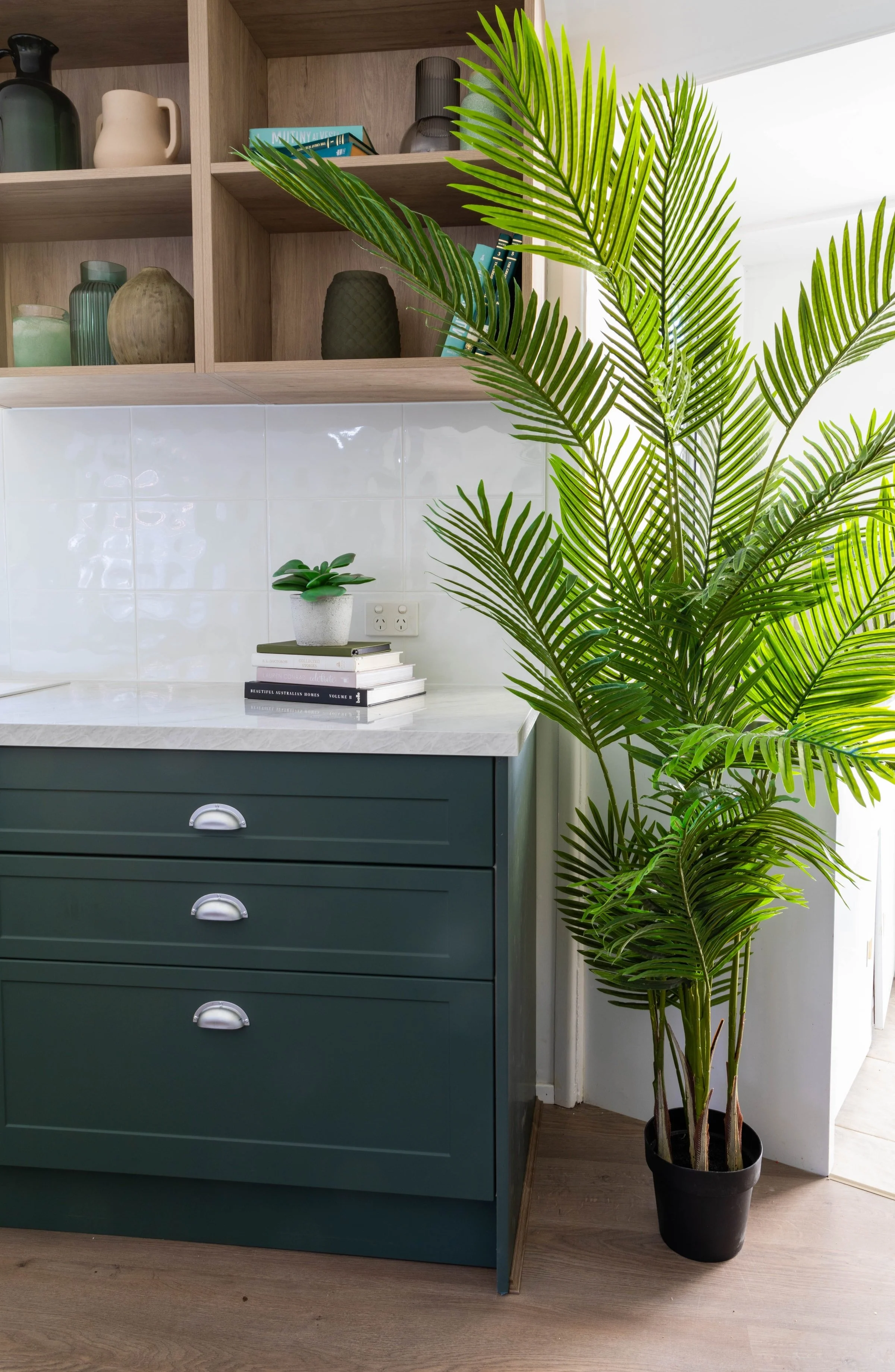
Wendy embraced a cool coastal colour story in this home, bringing forward some lovely deep teal blue greens in the kitchen cabinetry. The cabinets are in two colours from Kaboodle, available at Bunnings, neutral Cremasala paired with green throwing Matchamisu, with open timber-look shelving in Maplenut. The profile on the doors and drawers is Alpine, which is a great simple shape that doesn’t dominate the space.
Benchtops in classic Almond Brittle (also Kaboodle) and a white gloss splashbacks in Spanish porcelain subway tile 4411 (from Tile Factory Outlet) along with a Blanco sink (Pleon 8), matched with Linus tapware to complete the colour story.
A budget urban kitchen in Brunswick West
Kitchen style: Urban heritage
Key features: A bold colour palette with warming timber accents and splashes of black.
The brief: This kitchen was as basic as they come, with no pantry and no fridge and a giant abyss in the middle of the room. It needed an island in the centre to use up that valuable space: so practical for cooking and for a family to sit around. It also needed a cavity for a pantry and a family sized fridge.
How Wendy did it: Wendy revived some of the doors of the existing cabinetry by having them resprayed in the same colour as the new Kaboodle cabinetry. For the benchtop, she had a solid benchtop from the hardware store cut to size, and then stained it to match the colour of the floorboards.
Above, a pair of Tonic industrial pendant lights from The Lighting Outlet continues the industrial vibe, as well as black appliances (how cool). The oven and black glass cooktop were picked up at Technika and the stainless-steel French door fridge is Euromaid, with the final black touch in the Pleon 8 sink and Linus 5 tap in Black from Blanco.
A dash of elegance for the windows comes via the Caplypso Duette coverings in Calla from Luxaflex.
The kitchen triangle in Chipping Norton
Kitchen style: White and bright
Key features: It’s now practical and pretty with appeal for modern families.
The brief: An original display home kitchen of exceptional quality featured little in the way of modern conveniences, or even layouts. With a tight budget, this 1980s non-functional kitchen needed to appeal to a modern family.
How Wendy did it: Wendy worked with the original cabinetry of the square-shaped kitchen and followed the basic rule for maximum functionality and minimal congestion, creating the golden triangle’s tried and tested formula: placing the three main workstations near the cook, without putting them too close together or too far apart. In reality, it was as simple as replacing the pantry with the fridge. She also added a new bench top and created a cosy meals area. The team also painted over all the timber to make this whole kitchen feel more modern and fresh.


