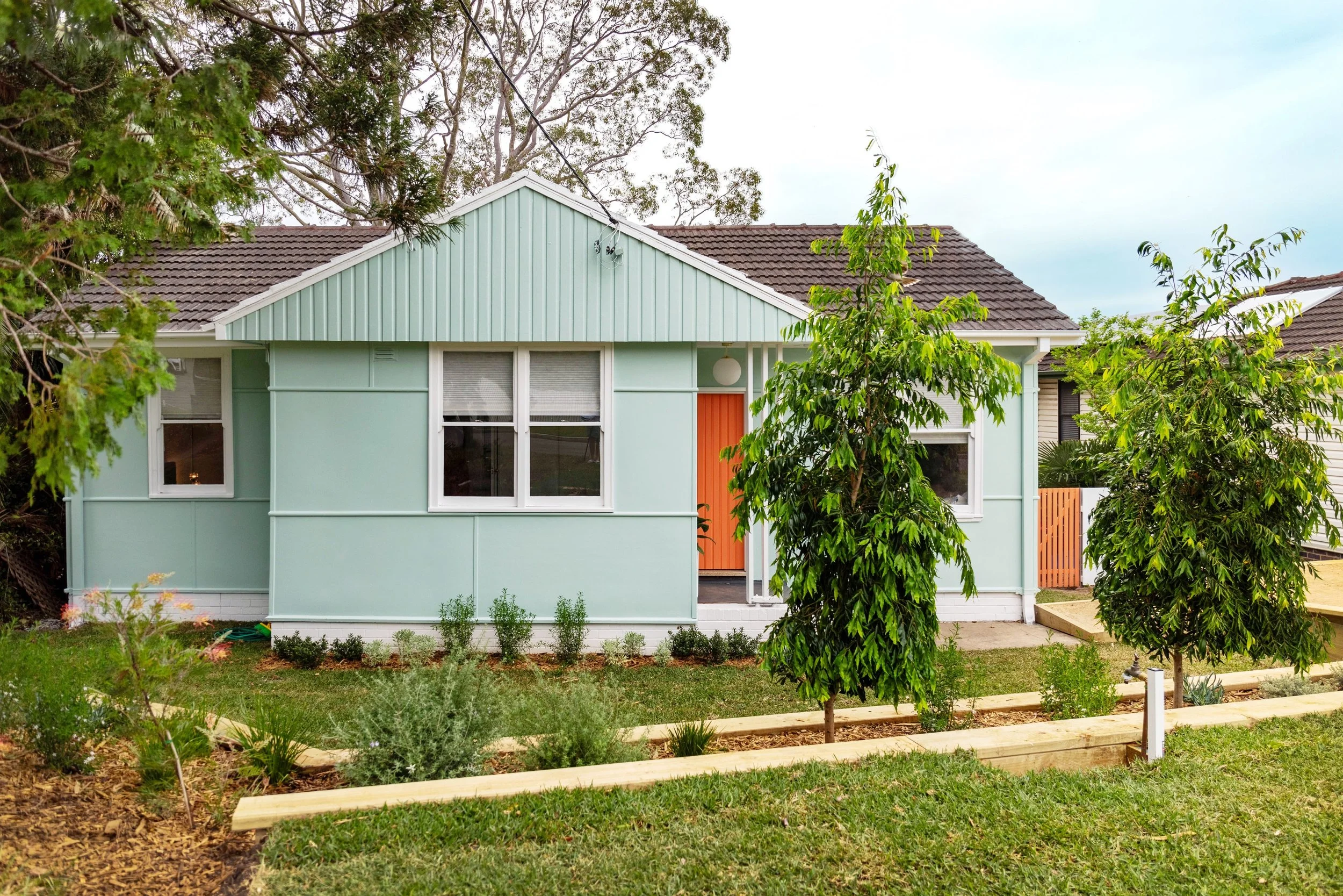
Did the Jannali home on Selling Houses Australia ever sell?
We transformed a rundown brown eyesore into a charming cottage – but was it enough to sell? Find out here
Photography Melissa Heath/Selling Houses Australia
The one colour I don’t really expect to see when I turn up at a renovation site is baby-poo brown. I mean, I’ve seen a lot of bad colour choices but this one really stands out! The area and the street were so pretty! But there stood Andrew, in front of the ugliest house in the street for our Selling Houses Australia Jannali episode. So much BROWN!
This was a case of homeowners Nicky and Danny simply outgrowing their little house. It was time to move on, and selling made sense to them – or it would, if anyone wanted to buy a tired old poo-brown fibro cottage. They’ve been working and saving hard but need a decent price to make it possible, and offers were low. So it was our job to make it simple!
“I could see that the bones of this house were in great shape, it was just hard to see them through the clutter of busy family life” ~ Wendy Moore
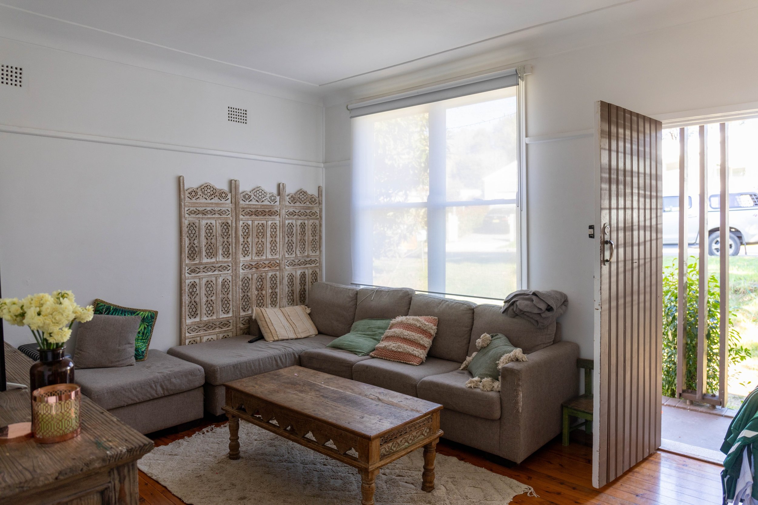
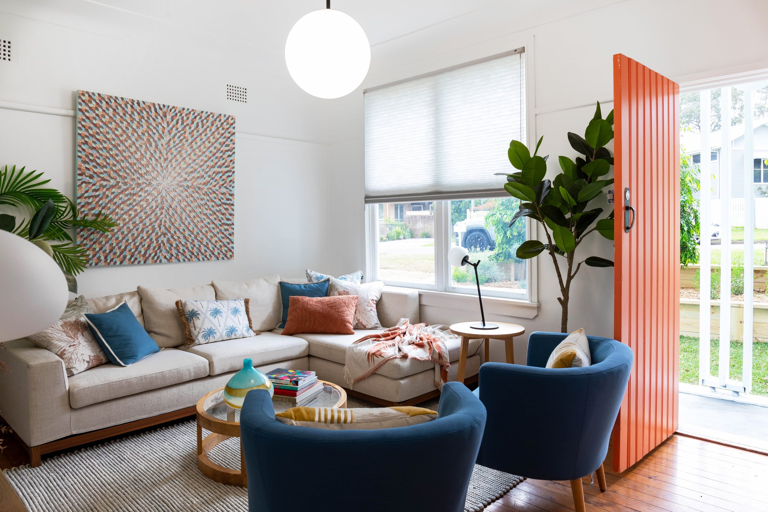
A little living room with great potential
First impressions of this living space: it had massive furniture and too much of it, but the original floors and sash windows were in really good condition. At some point the home’s interior was painted white, which was a good move. In a small house, keeping the colour scheme consistent helps to increase the sense of space, so for the same reason I chose Wattyl White from Wattyl for the majority of the rooms, which really did need a refresh. I also wanted to lean into its retro vibes with fun styling and pops and colour.
For this quirky little living space, we updated the blinds to new Duette Jagger Translucent blinds in Pewter from Luxaflex: not a massive change but visually it was totally transformed. Underfoot, I went with a Terrace 5502 Black rug from Flooring Xtra, and above a Bally 16 Pendant light from The Lighting Outlet (you’ll see these throughout the home - consistency really helps when a footprint is as small as this one).
I wanted to bring in some bold colour through artwork, and chose Blue Crush by Guzaliya Xavier, available from Art Lovers Australia.
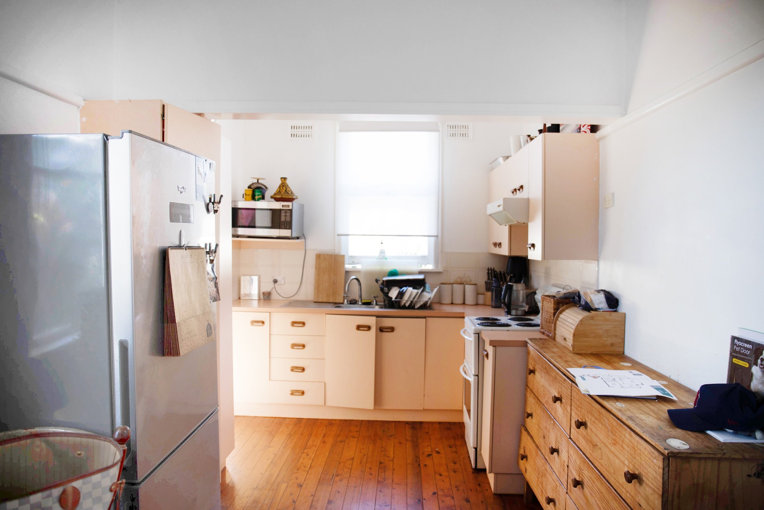
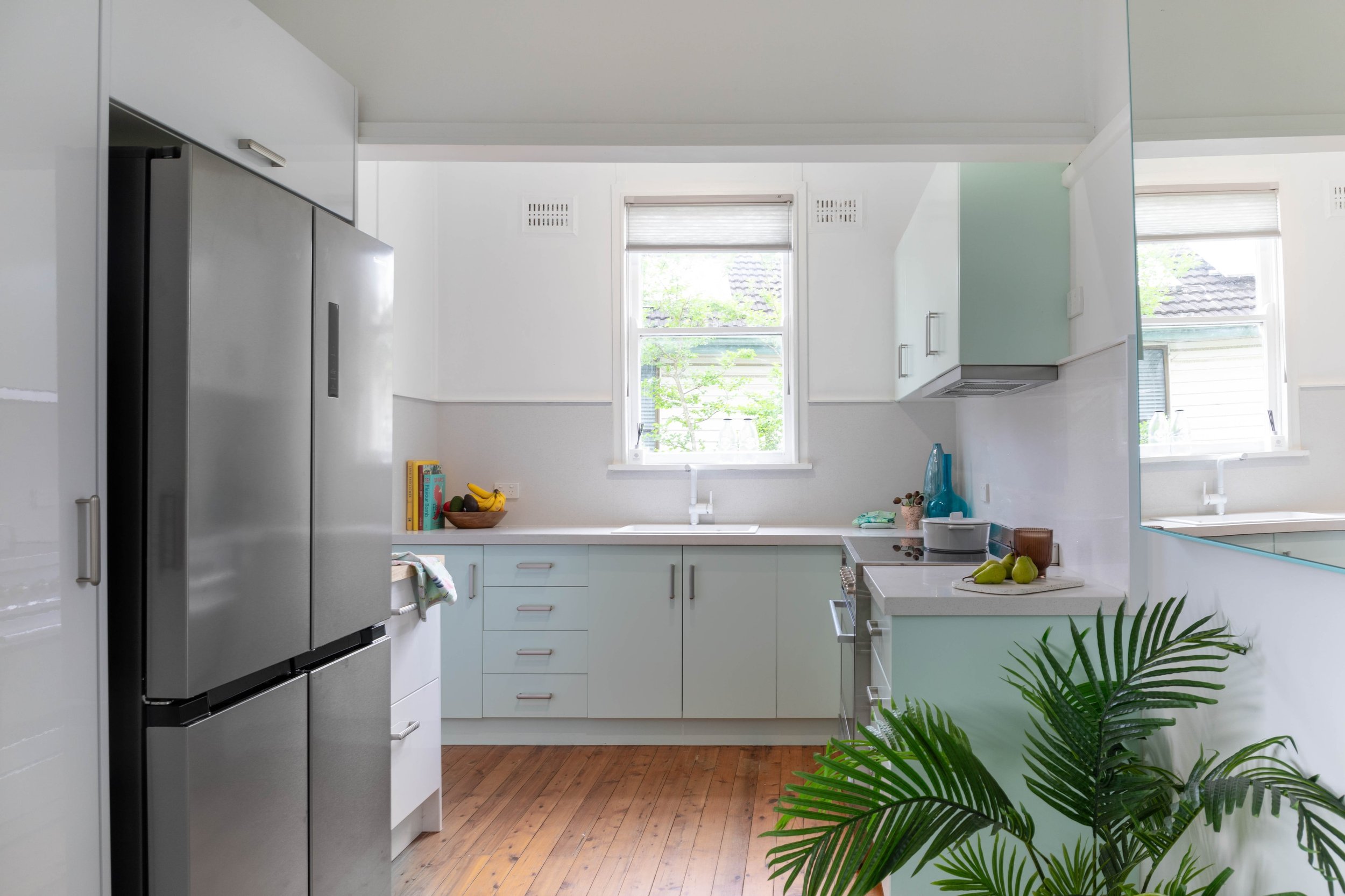
A cute kitchen reborn on Selling Houses Jannali
It’s always important to check in homes of this style and era that there isn’t asbestos before work begins, and in this case, we did have to safely remove some. The homeowners ate most of their meals in the lounge, which isn’t a big sell to a potential buyer, so I knew we needed to return the kitchen and dining zone into a functional space. The kitchen cabinets didn’t even shut!!
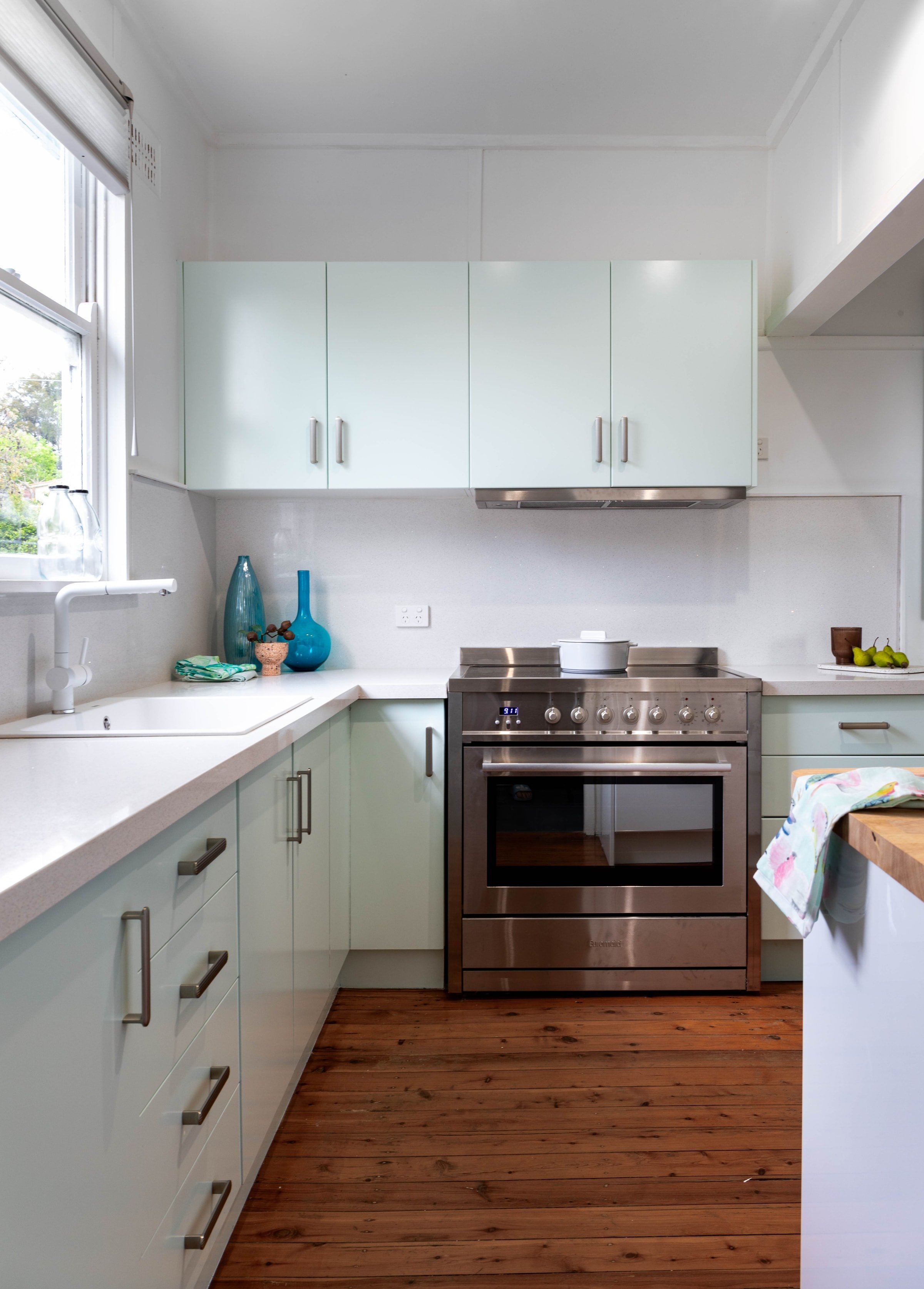
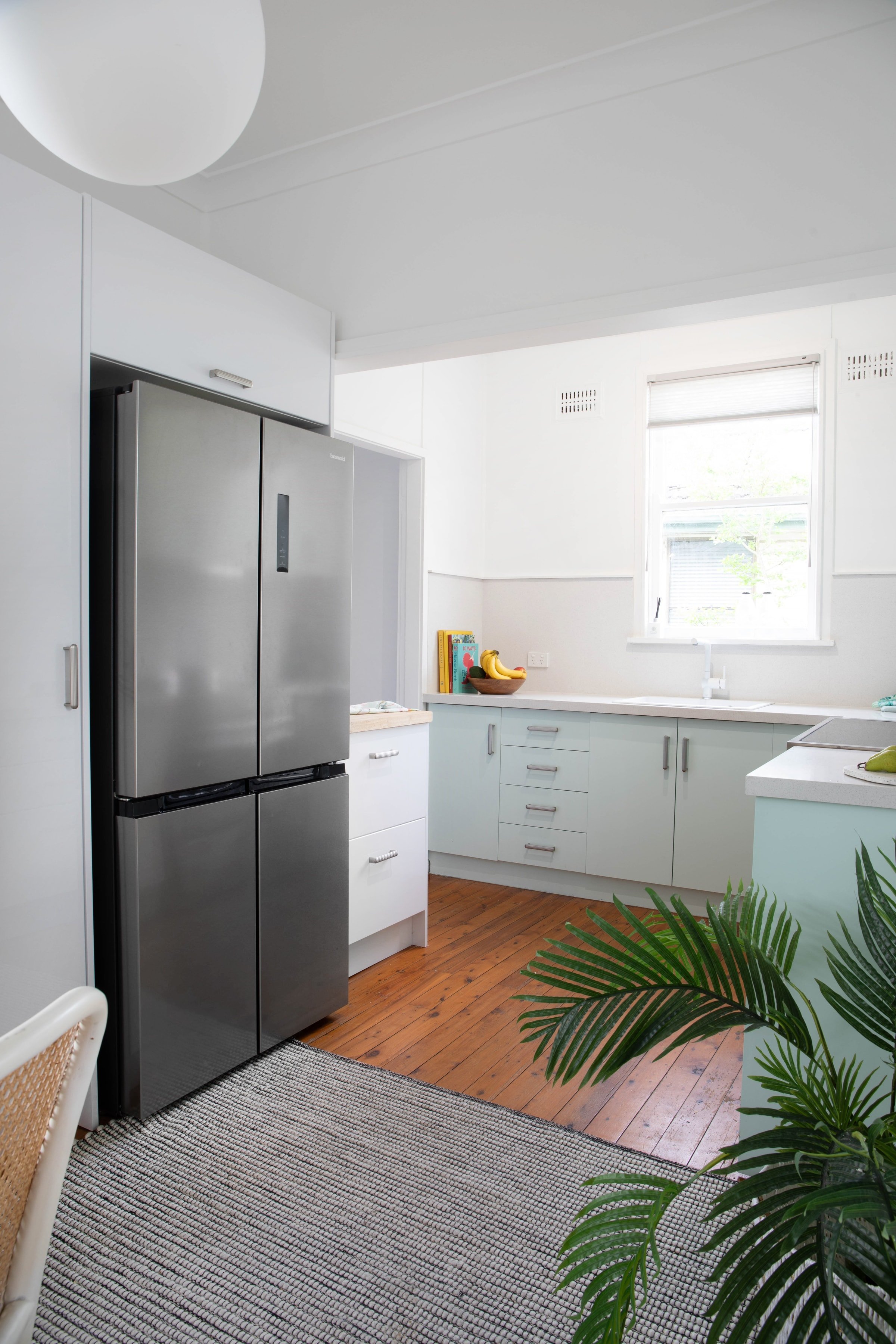
To make the most of every inch, I replaced clunky furniture, like a tallboy in the kitchen, with new Kaboodle cabinetry to match the existing. Aside from the hinges, we kept the original cabinetry in the kitchen and had it professionally refinished in a beautiful ice blue Otto Ice Half from Wattyl, adding stainless-effect handles from Kethy. Then I did something special with the benchtop and splashback: it’s the Classic range in Stardust from Granite Transformations. We also added a Naya 1 sink and Linus tap, both from Blanco, Duette Jagger Translucent blinds in Pewter from Luxaflex and new track lights from The Lighting Outlet.
To make this zone even more practical, I added a space-saving breakfast nook by building a built-in banquet out of flatpack cabinetry. This combination was created using a Kaboodle slimline cabinet and Hevea timber benchtops, available at Bunnings. The artwork is It is not always black and white II by Guzaliya Xavier, available from Art Lovers Australia.
Appliances used: I chose a 474L French door fridge in stainless steel (EFD474S); a 60cm freestanding dishwasher (EDW6014X); 90cm Freestanding electric oven with gas cooktop in stainless steel (EGE9TS), all Euromaid.
Now, it’s bright, well organised and family friendly. And the dinky little laundry was transformed into a butler’s pantry to reduce pressure on the main zone (more below).
A laundry meets butler’s pantry
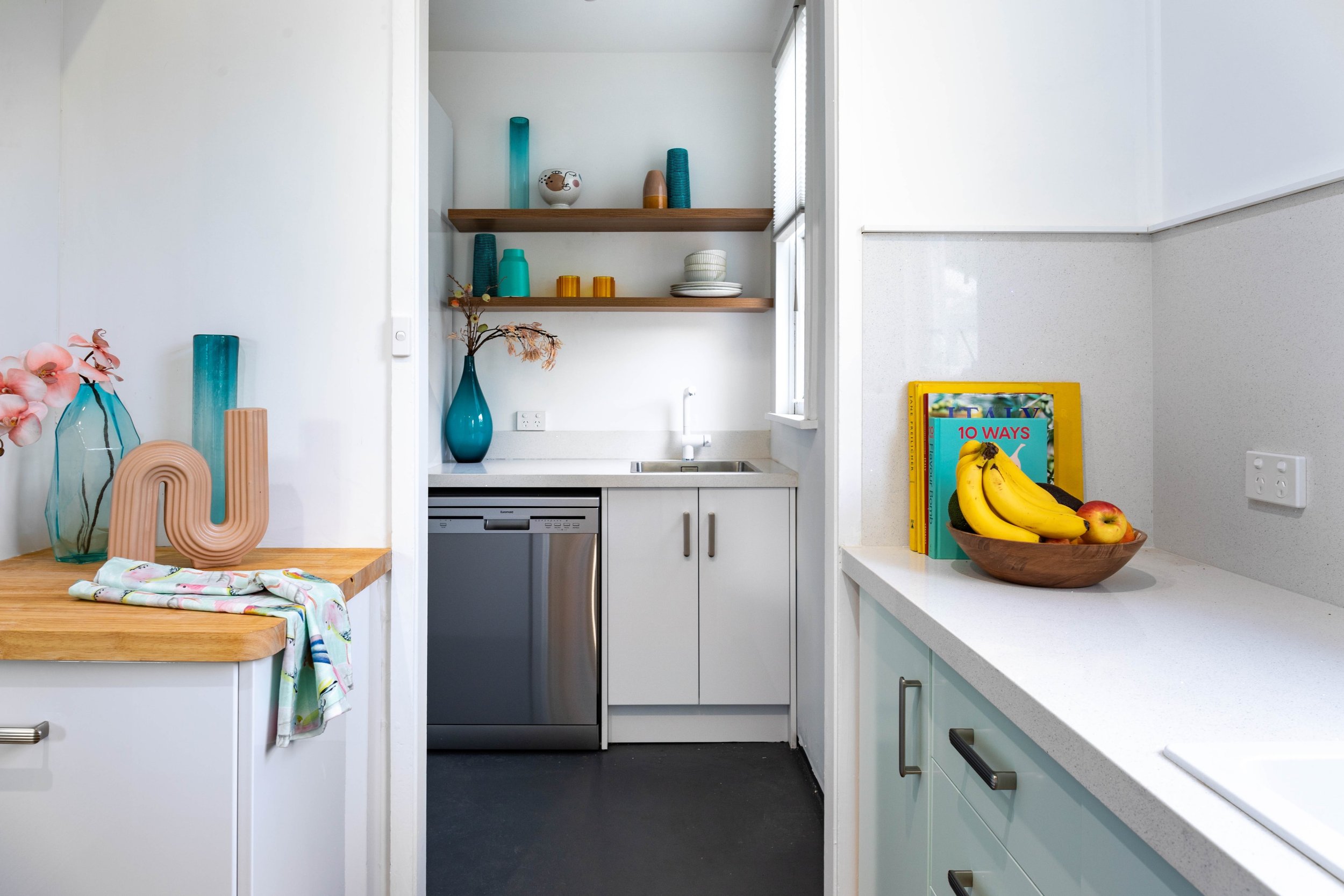
Off the kitchen was the laundry, which was the only access to the backyard. Almost an extension of the kitchen, it has become a transitional space to the backyard, but I wanted to make it into more of a butler’s pantry-meets-laundry. This new zone is painted in Wattyl White from Wattyl, like the majority of the home.
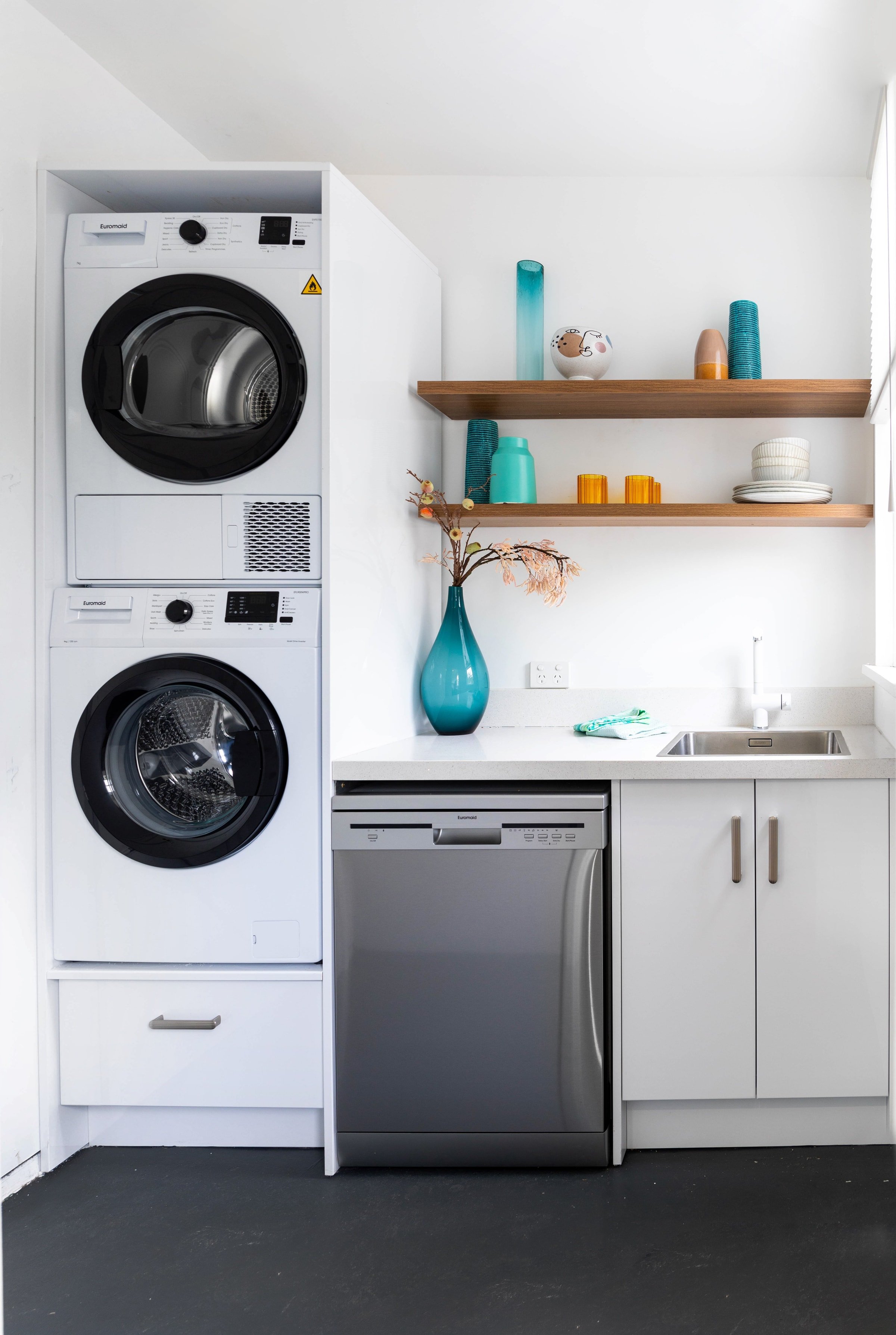
It made sense to stacked the washer and dryer to make the most of this space. We also brought in some new Kaboodle cabinetry and added some floating shelves, adding beauty and practicality. An Andano 400-IF stainless-steel laundry sink from Blanco and the same Naya tap used in the kitchen keep it super functional, and the windows are now dressed in stunning Duette Jagger Translucent blinds in Pewter from Luxaflex.
We went with the 7kg heat pump dryer in White (EHPD700W) and a 9kg front loader washing machine in White, both Euromaid.
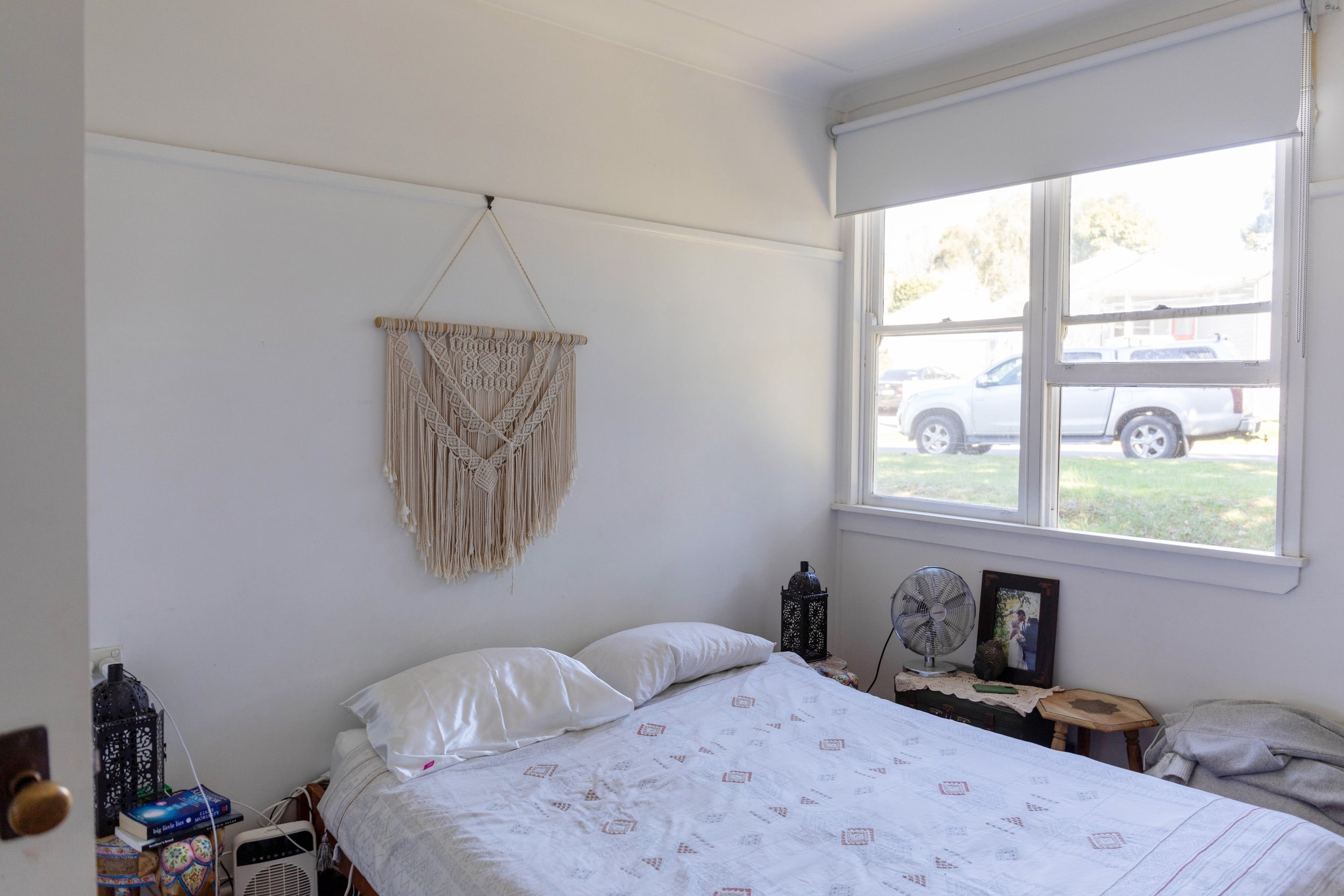
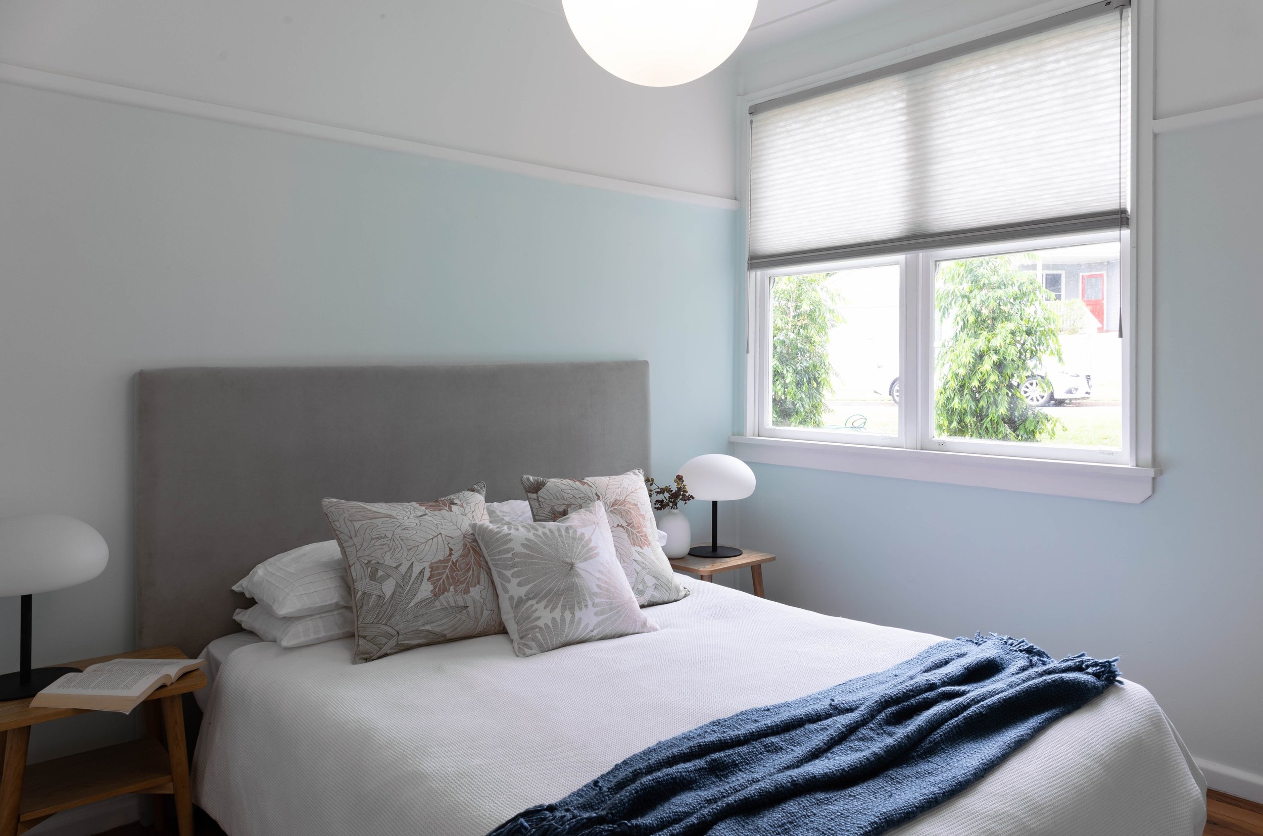
A cool blue master bedroom from Jannali Selling Houses
I wanted to set a different tone in the master bedroom, so chose a gorgeous icy blue, Sea Lantern from Wattyl. It’s reminiscent of the blue of the kitchen cabinets but a little softer and more romantic. Picture rails meant I could use colour without covering the whole room. A different tone about the rail adds interest and contrast.
As used elsewhere, I chose Duette Jagger Translucent blinds in Pewter from Luxaflex with top down/bottom up blockout blinds - ideal for the room of a shift worker! Softness comes via lots of cushions from Rapee, as well as a Terrace 5502 Black rug from Flooring Xtra and Bally 16 Pendant light from The Lighting Outlet.
The final, beautiful touch is the artwork: Turquoise Dreams (night) by Guzaliya Xavier, available from Art Lovers Australia. Now, the bedroom now has a lovely vibe and really feels like a haven.
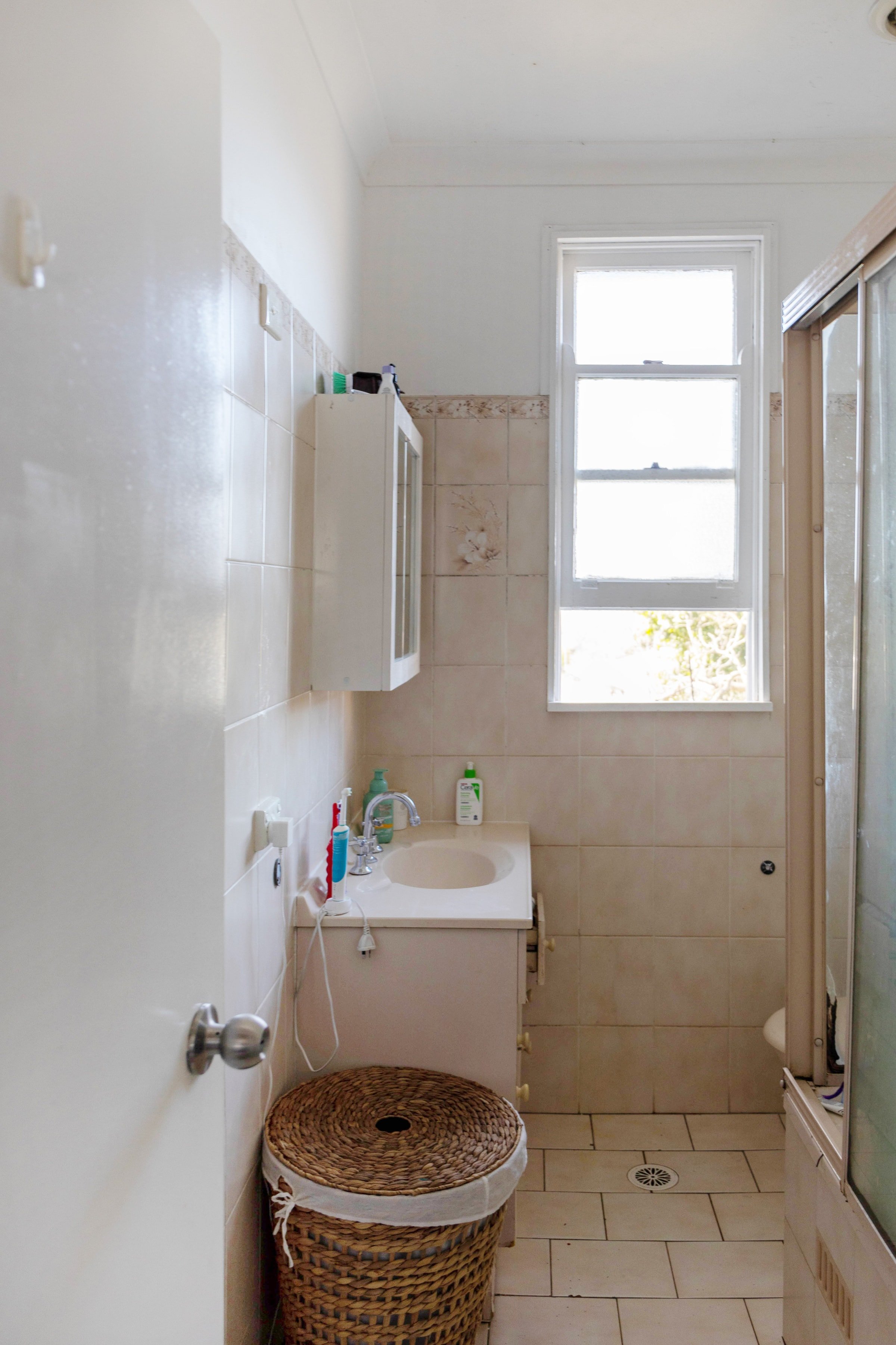
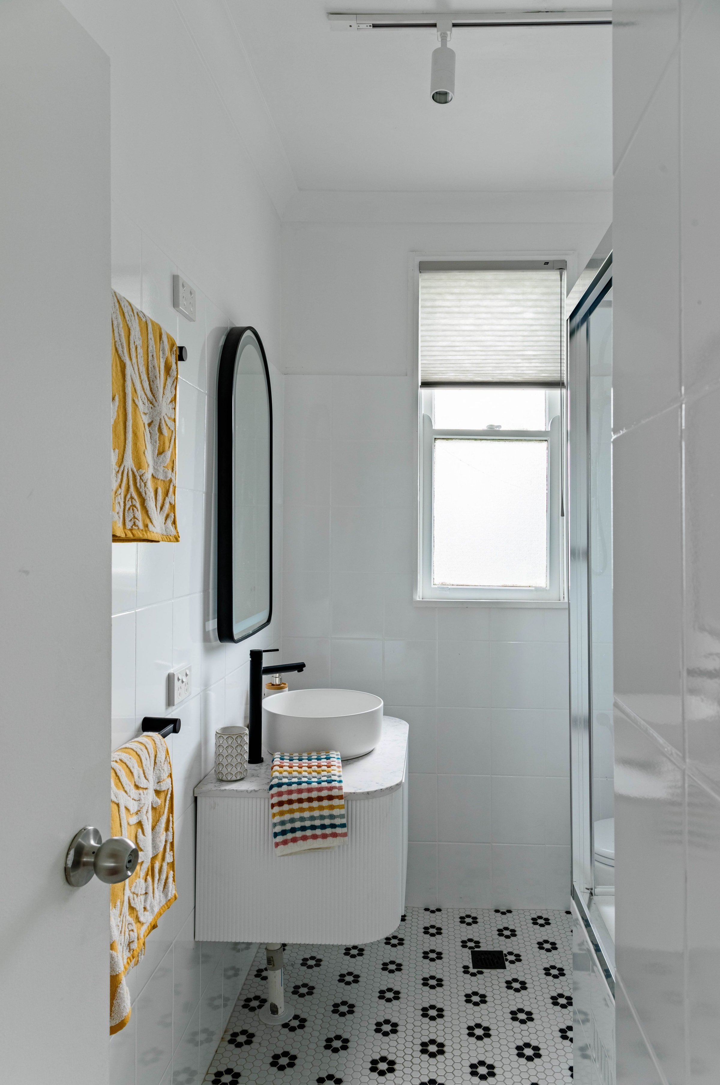
Selling Houses Australia Jannali’s budget bathroom
The bathroom renovation of this home was dated circa 1980s and it was in dire need of an update. As the only bathroom in the home, it wasn’t practical – it was so difficult to even get into the shower over bath. Andrew charmingly referred to it as “the Wendy model”, cos it was tiny and he likes to remind me about my short stature as often as possible!
We resprayed the wall tiles white, which made it feel lighter and brighter and more spacious. We also brought in this gorgeous little mosaic floor tiles that had a fun mid-century vibe; these ones are Vintage Daisy Black & White Ceramic Mosaic 7606 from Tile Factory Outlet. A new ADP Waverly vanity and Ingrain arch-shaped framed mirror in Matte Black, both The Blue Space, along with fresh black bathroom fittings found at Bunnings and a new shower screen and it felt like a brand new bathroom in there!
The sales history of the Selling Houses Jannali home
You can find Jannali in the Sutherland shire in southern sydney. Couple Nicky and Danny bought this property in 2012 and paid $520K for it. When they decided to sell, it sat on the market for four months and only had one offer for around 900-920K They were hoping for $1.2-1,25 million! Potential buyers had complained that the home was too small, which was not something we could resolve for them. We had hoped that the cosmetic update would make it more marketable. After the renovation, the agent felt $1.1-1.2 million was a realistic expectation.
Did Selling Houses Jannali ever sell?
Unfortunately, Selling Houses Australia Jannali didn’t sell and is currently off market. Despite a potential increase of $500K in the home’s value (based on market feedback post the makeover), the couple become anxious that with interest rate rises, they wouldn’t be able to manage the mortgage repayments on a new property. They did list the home but the night before the auction, decided it was not the right move for them, and that they should make it work in the home for now.
I know that viewers love to see the homes sell, and so do we! But it is real life, and everyone is under some very real cost-of-living pressure. Nicky and Daniel simply felt they might not be able to manage an increased mortgage repayment on a bigger property. It was the right decision for them.
Who pays for the renovations on Selling Houses Australia?
The homeowners, Nicky and Daniel, supplied $55K, and we supplied all the labour. They actually wanted to put $70K into it, but we had to factor that it might be purchased as a knock-down rebuild, in which case, it would be overcapitalised. The brief became to make it a cool little character cottage that people would want to live in. Ultimately, it’s become a nicely renovated home where the couple can live until they decide they are ready to take the next step.
